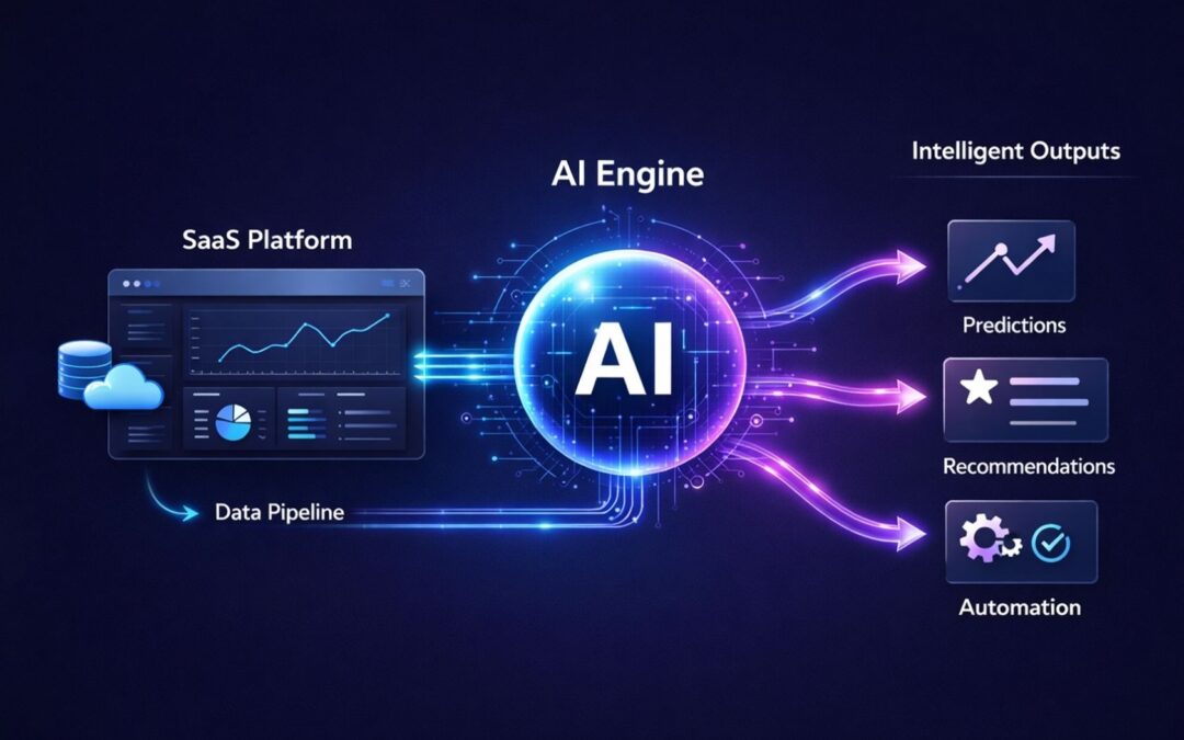
Artificial intelligence continues to reshape how products in the SaaS industry deliver value to users. Many Software as a Service platforms now rely on automation and advanced data processing to improve product functionality and user experience. Integrating AI into SaaS products allows companies to analyze large volumes of data and turn that information into actionable insights through data analytics.
Businesses that incorporate AI into product workflows can introduce smarter automation, personalization, and decision support tools. AI powered features such as predictive recommendations, intelligent assistants, and automated workflows help improve efficiency and product usability, especially when you understand the differences between AI automation and traditional automation. For many companies, AI adoption is no longer just a trend but a strategic shift in product development.
As AI capabilities expand across analytics, automation, and customer insights, more SaaS teams are exploring how to integrate AI into your SaaS platform to deliver smarter digital experiences and long term competitive advantages, building on the broader trends shaping AI in SaaS, its benefits, challenges, and future.
What Is AI In SaaS Products
AI in SaaS products refers to embedding machine learning models, generative AI, and intelligent automation directly into cloud-based software. This goes beyond traditional rules-based systems. SaaS platforms with artificial intelligence capabilities can process raw data dynamically, predict user behavior, and automate repetitive tasks at scale.
The numbers tell the story. The global AI SaaS market reached 71.54 billion dollars in 2023. Analysts project a 38.28 percent compound annual growth rate, pushing the market to 775.44 billion dollars by 2031. Today, organizations use an average of 7.3 SaaS apps with AI capabilities. About 92 percent of SaaS companies plan to expand their AI features further.
How To Integrate AI Into SaaS Products
Building AI powered saas platforms requires a structured approach. Teams that rush into implementation often face data quality problems, integration headaches, and features that fail to deliver value, so leaders benefit from a complete guide to AI-driven automation in SaaS when planning their roadmap.
Identify High Impact AI Use Cases
Begin by mapping AI capabilities to real customer pain points. Review support tickets, sales objections, and churn data from the past year. Look for patterns where manual work slows users down or where decision making could benefit from data driven decisions.
High-impact areas typically include customer support automation, which 40 percent of relevant SaaS applications already use. IT service management shows 45 percent adoption. Predictive lead scoring on platforms like Salesforce has boosted conversion rates by 20 to 30 percent. Anomaly detection in finance tools helped early adopters resolve issues 25 percent faster.
Rank potential use cases based on user impact, data availability, and technical complexity. Select one primary and one secondary use case for your first release. This focused approach leads to successful AI integration rather than scattered efforts.
Build A Strong Product Data Foundation
High quality data underpins every successful AI feature. Yet 70 percent of enterprises deem their data unfit for advanced AI applications according to 2026 reports.
Start with data collection from structured sources like user sessions, transactions, and customer feedback. Clean your data through normalization and deduplication. Feature engineering prepares datasets for machine learning algorithms. Many teams rely on dedicated predictive analytics software to streamline this work, and AI-native saas platforms have reduced preparation time by 50 percent using automated data analysis tools.
Separate training data from evaluation sets and runtime user data. This matters especially in regulated spaces like finance, healthcare, or HR. Add basic observability from day one. Log which data fields feed each AI feature so debugging becomes straightforward when users report issues.
Select The Right AI Models And Tools
Choose AI models based on your specific use case and team capabilities. Pre built ai models from providers like OpenAI or Hugging Face offer speed to market. Fine-tuning open-source options like Llama provides more customization for domain-specific tasks.
Gartner predicts 80 percent of enterprises will deploy generative AI APIs by 2026. Compare costs carefully. Cloud APIs work well for prototypes, while on-premises models control expenses over the long term. About 55 percent of AI purchases come from central IT budgets, favoring scalable saas ai tools.
Vertical SaaS platforms selecting domain-tuned models achieve 15 to 20 percent higher accuracy in specialized tasks. Exploring broader AI software development for smarter digital products can also clarify which options fit your stack. Various ai tools exist for different purposes. Match the tool to your problem rather than chasing the latest model release.
Integrate AI With Existing SaaS Architecture
Use APIs and microservices to layer AI capabilities without rewriting your entire codebase. This approach preserves existing workflows while adding intelligent automation where it matters most and aligns with best practices of SaaS architecture.
Embedded integration platforms are evolving into orchestration layers for agentic workflows. Standards like MCP provide unified contexts and reduce permission issues. Notion integrated AI models via plugins and cut development time by 40 percent. Scale with serverless compute to manage variable loads.
Architectural decisions matter. Decide whether to call AI synchronously inside user flows or asynchronously via background jobs. Consider caching common AI results. Plan for when to store versus discard prompts and outputs as part of preparing for the future of SaaS development in a cloud-first world.
Deploy AI Features Within User Workflows
Keep AI features inside the flow of your existing product. Place them in views users already know, next to buttons they use every day. This approach leads to higher user adoption and customer engagement.
By late 2026, agents are expected to replace 20 to 30 percent of traditional user interface interactions. Design for seamless handoffs between AI assistants and human actions, investing in UI/UX design services for SaaS products to keep experiences intuitive. HubSpot’s AI assistants guiding sales flows increased engagement by 35 percent.
Build clear states in your UI. Show when the AI is processing. Label suggestions clearly. Provide simple ways to accept, edit, or reject AI output. Users should feel in control of the experience.
Monitor Model Performance And Accuracy
AI work does not end at launch. Models, prompts, and user behavior all shift over time. Track metrics like precision, recall, and model drift using monitoring tools.
About 73 percent of routine AI management will be automated by 2028. Set alerts for bias and plan to retrain models quarterly. Automated monitoring becomes essential as teams scale. BetterCloud data shows IT teams strained at 1:108 ratios between staff and applications managed.
Use a mix of offline evaluation with historical data and online checks through A/B tests and gradual rollouts. Track feature adoption, completion rates, time saved, and support tickets related to AI outputs as part of broader SaaS performance optimization best practices.
Continuously Improve AI Capabilities
Iterate through feedback loops and A/B testing. About 92 percent of SaaS firms plan to increase their AI investments. Agentic AI is projected to reach 26 percent of IT spending by 2029.
Collect user feedback directly inside your product. Add thumbs up and thumbs down buttons on AI responses. Let users explain what went wrong in their own words. This feedback drives continuous improvement and helps unlock ai’s full potential.
Vertical AI platforms refining for context report 10 to 15 percent yearly gains in outcomes. Stay ahead by reviewing performance data weekly and adjusting your approach based on real usage patterns, feeding those insights into a living SaaS product roadmap.
Why SaaS Companies Are Adding AI Features
SaaS providers face mounting pressure to deliver smarter experiences. The global SaaS market reached 300 billion dollars in 2025, fueled by AI enhancements and the rise of scalable SaaS tools that power global growth.
Demand For Smarter Product Experiences
Users expect intuitive interfaces that anticipate their needs. About 78 percent of organizations now integrate AI technologies to meet this demand. Customers want personalized dashboards and context-aware help rather than generic one-size-fits-all tools.
AI delivers experiences that reduce tool fatigue. Single intelligence layers replace scattered functionality across multiple apps and behave like smarter software tools that simplify day-to-day work. This shift transforms how businesses operate and how users interact with SaaS tools.
Need For Automation In SaaS Workflows
Manual work blocks strategic progress for 60 percent of IT teams. Automation targets routine tasks that consume valuable time. About 30 percent of workflows will shift to intelligent automation by 2027.
SaaS businesses that automate repetitive tasks free their teams to focus on higher-value work. AI agents handle data entry, scheduling, and basic customer interactions, similar to many modern artificial intelligence software solutions. This shift improves efficiency and user satisfaction simultaneously.
Rising Volume Of Product Data
Data integration markets grow from 17.58 billion dollars in 2026 at 13.6 percent CAGR. Enterprises struggle to process data volumes manually. AI systems turn vast amounts of customer data into actionable insights.
Machine learning algorithms identify patterns in historical data that humans would miss. This capability transforms raw data into valuable insights that inform product decisions and improve customer experiences, especially when powered by robust predictive analytics software.
Competitive Pressure From AI Native Products
AI-native applications see 108 percent spend growth. About 33 percent of large firms deploy agentic AI capabilities. Legacy systems without AI features lose competitive edge quickly.
New entrants build AI first rather than adding it later. SaaS providers must respond or risk losing market share to more intelligent competitors.
Opportunities For Data Driven Insights
Multimodal AI turns scattered data into coordinated actions. About 70 percent of organizations need better platforms for data analysis. Leaders leveraging AI gain 20 to 25 percent efficiency advantages over competitors.
AI powered tools surface insights that drive better products and happier customers. This capability creates lasting competitive advantages in crowded markets.
Key AI Capabilities SaaS Products Can Add
Different AI capabilities serve different purposes. Choose features based on your product’s core value proposition and user needs, drawing from broader principles of AI software development for intelligent products.
Predictive Analytics For User Behavior
Forecast churn, upsell opportunities, and engagement patterns. Zendesk models predict support issues 24 hours early, cutting resolution time by 15 percent. Predictive analytics transforms reactive support into proactive customer care and becomes a cornerstone of AI-driven automation in SaaS.
Machine learning algorithms analyze historical data to identify users at risk of churning. This allows teams to intervene before customers leave. Similar approaches work for identifying expansion revenue opportunities.
Natural Language Interfaces And Chatbots
Natural language processing powers 40 percent of support applications. AI powered chatbots handle 80 percent of routine queries autonomously. Virtual assistants provide 24/7 availability without staffing costs.
These interfaces let users interact with software through conversation rather than complex menus. The result is faster answers and higher customer satisfaction when paired with thoughtful UI/UX design for SaaS products.
Intelligent Product Recommendations
Collaborative filtering approaches similar to Netflix boost retention by up to 75 percent. Recommendation engines analyze user behavior patterns to suggest relevant features, content, or actions.
This capability works across SaaS applications from project management tools suggesting next steps to marketing automation platforms recommending campaign adjustments.
Automated Workflow Optimization
AI agents orchestrate tasks across multiple tools. About 42 percent of large organizations scale multi-function agents. These systems handle complex workflows that previously required manual coordination.
AI driven features reduce the need for users to switch between applications. Workflows complete faster with fewer errors, often driving measurable engagement gains such as AI features that increased engagement by 34%. This represents a fundamental shift in how SaaS solutions deliver value.
AI Powered Product Insights
Analyze usage patterns to inform roadmap decisions. About 76 percent of organizations use AI for operational insights. Product teams gain visibility into how features perform and where users struggle.
These insights drive better prioritization decisions and help teams build features customers will pay for.
AI Integration Challenges In SaaS Development
Implementing AI brings real challenges. Understanding these obstacles helps teams prepare and avoid common pitfalls, especially when you recognize the broader benefits, challenges, and trends of AI in SaaS.
Data Quality And Data Preparation
About 70 percent of enterprises report unreliable data for AI applications. Poor data quality inflates preparation costs by 40 percent. Garbage in produces garbage out regardless of model sophistication.
Data security concerns add complexity. Teams must balance accessibility for AI training with protection of sensitive customer information. This tension requires careful governance frameworks.
Model Accuracy And Bias Risks
Model drift affects 25 percent of deployments over time. AI systems trained on biased data produce biased outputs. Regular audits help identify problems before they impact customers.
Plan for ongoing model maintenance from day one. Set up evaluation benchmarks and monitor for accuracy degradation. Bias testing should be part of every deployment checklist and woven into your broader SaaS performance optimization strategy.
Infrastructure And Compute Costs
AI spend management concerns 63 percent of organizations today. That number rises to 96 percent by 2026 projections. Agentic AI at scale could require trillions in infrastructure investment.
Track costs per workspace or customer segment. Set usage limits that align with pricing tiers. Plan for variable compute loads as AI features gain adoption, following best practices for SaaS architecture to stay efficient.
Security And Privacy Concerns
Over-permissioning creates risks when AI systems access customer data. Standards like MCP help mitigate these concerns. Enterprise customers demand clear documentation about data handling.
Data security requirements vary by region and industry. AI saas products serving EU customers face GDPR requirements. Healthcare applications must meet additional compliance standards.
AI Adoption Across Product Teams
About 59 percent of organizations prioritize automation training for staff. Meanwhile, 60 percent of IT teams report feeling overburdened. User adoption depends on teams understanding and trusting AI features.
Training investments pay off through faster implementation and better outcomes. Teams that understand AI capabilities make better decisions about where and how to apply them, often with support from specialized tech consulting services.
Best Practices For Building AI Powered SaaS
Proven approaches separate successful AI integrations from failed experiments. Follow these practices to improve your chances of success and to align with holistic SaaS product development best practices.
Start With Small High Value AI Features
Pilot quick wins before attempting comprehensive AI transformation. Chatbots, summarization features, or smart search make good starting points. Validate outcomes before expanding scope.
Small successes build organizational confidence and teach valuable lessons. Scale after demonstrating clear user value and positive metrics, using them as proof points for broader scalable SaaS growth initiatives.
Align AI With Core Product Workflows
Embed AI features into native user paths. Teams see 35 percent higher uptake when AI appears within familiar workflows rather than as separate tools.
Users should encounter AI assistance at natural decision points. The technology should feel like a seamless extension of existing capabilities, much like modern AI-powered tools that simplify daily work.
Maintain Transparent AI Outputs
Explainability builds trust with users and administrators. About 76 percent of leaders believe AI automates tasks without eliminating roles. Clear communication about AI behavior matters.
Label AI-generated content clearly. Provide links to explanations about how features work. Let workspace owners configure AI behavior for their teams.
Train Teams On AI Product Strategy
Upskill teams to achieve meaningful AI adoption. Projections show 50 percent of software management platform adoption by 2027 will require AI literacy.
Training should cover both technical capabilities and strategic applications. Teams that understand AI possibilities identify better use cases for their products and can better navigate the broader software services landscape, including SaaS and other cloud models.
Continuously Evaluate AI Performance
Metrics-driven feedback loops ensure ongoing improvement. Teams following this approach report 15 percent yearly gains in AI feature effectiveness.
Set clear success metrics before launch. Review performance weekly. Adjust prompts, models, or data inputs based on results.
How GainHQ Helps SaaS Teams Use AI In Sales
GainHQ focuses on helping SaaS businesses improve sales productivity through AI-powered approaches. Industry benchmarks show AI boosts sales productivity by 25 to 50 percent, and real-world examples include AI features that increased engagement by 34%.
AI Powered Prospect Research
GainHQ automates firmographics and intent signal analysis. Sales representatives save up to 20 hours weekly on research tasks. This time goes back into actual selling activities, often guided by broader tech consulting services for modern businesses.
Automated Lead Qualification
Machine learning scores leads with 40 percent higher accuracy compared to manual qualification. Sales teams focus energy on prospects most likely to convert, mirroring the principles of AI-driven automation in SaaS.
Data Driven Sales Insights
Predictive models forecast deal velocity and pipeline health. Users report 30 percent pipeline growth through better prioritization and timing when supported by robust predictive analytics platforms.
AI Driven Sales Workflow Automation
Orchestrated outreach sequences close deals 25 percent faster. Teams spend less time on administrative tasks and more time building relationships with qualified prospects, similar to companies transformed by custom software built around their workflows.
Frequently Asked Questions
What Are The First Steps To Add AI To SaaS
Start by auditing your existing data and user workflows. Identify one specific pain point where AI could deliver measurable improvement. Review support tickets and churn data to find candidates. Then pilot a single use case like predictions or automated responses before expanding.
How Much Data AI SaaS Products Need
Basic AI features require minimum 10,000 samples to function reliably. More sophisticated models scale to millions of data points for accuracy. However, 70 percent of organizations cite data quality as more important than data volume. Clean, well-structured data outperforms messy large datasets.
Can Small SaaS Products Integrate AI
Yes. Small teams ship AI features using managed APIs and existing engineering talent. Low-code AI tools enable startups without dedicated data science departments. About 92 percent of SaaS companies plan AI expansion regardless of current size.
What AI Models Work Best For SaaS
GPT-series models work well for language tasks like summarization and chat. Llama suits custom fine-tuning for domain-specific applications. Generative APIs will appear in 80 percent of enterprise applications by 2026. Match the model to your specific use case rather than defaulting to the newest option.
How Long AI Integration Usually Takes
Focused AI features move from concept to live beta in 4 to 8 weeks. This assumes stable codebase, clear data models, and reliable AI provider access. More advanced use cases requiring fine-tuned models or compliance work extend timelines to 3 to 6 months for MVPs and up to 12 months for full scale deployment.
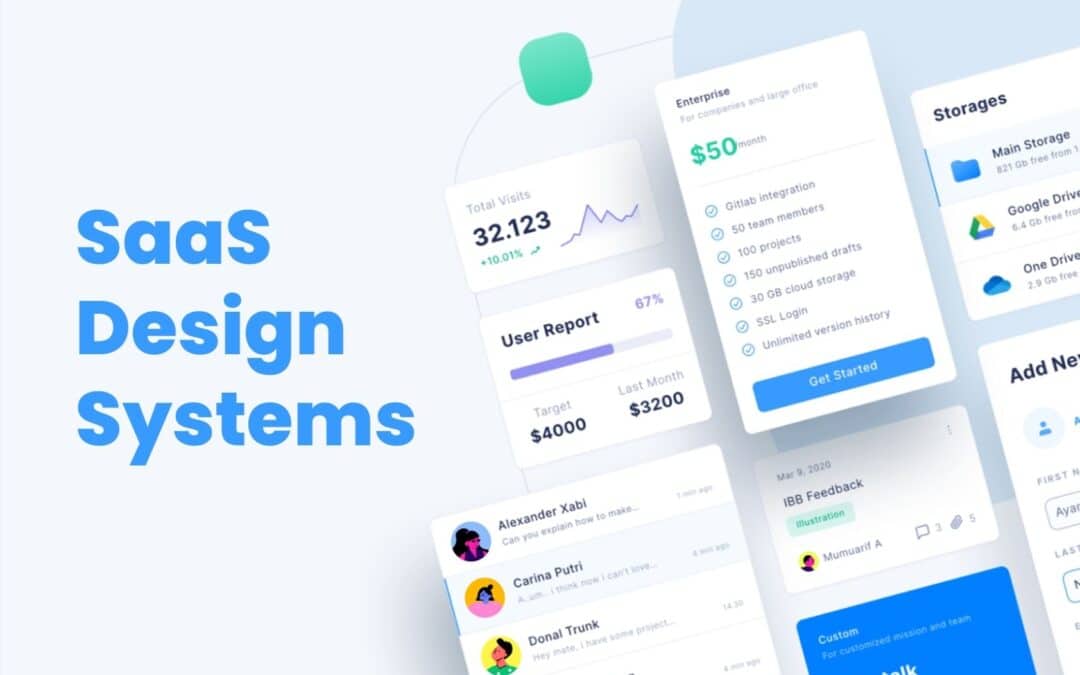
SaaS Design systems play a major role in helping SaaS products grow without losing clarity, quality, or consistency. As SaaS platforms expand with new features, new screens, and new user expectations, teams often struggle to keep the design aligned across the entire product.
A solid design system solves this problem by giving teams shared rules, reusable components, and visual standards that make every part of the product feel connected. It reduces rework, speeds up collaboration, and helps designers and developers build faster without sacrificing quality.
For SaaS companies aiming to scale smoothly, a strong design system becomes a foundation for better structure, better teamwork, and better user experiences across all touchpoints.
What A Design System Means For SaaS Teams
A design system is an essential tool that helps SaaS teams create products with clarity, consistency, and efficiency. For growing SaaS products, it acts as a shared foundation that keeps every part of the interface aligned. Design systems SaaS teams rely on include core elements such as color, typography, spacing, and patterns that shape a unified design language across the entire user interface. This structure makes it easier to support a cohesive user experience as the product evolves.
By addressing user needs through predictable layouts and reusable assets, teams avoid design drift and unnecessary rework. A strong design system ensures that every update, feature, or screen feels connected and maintains the overall quality users expect.
Why SaaS Products Need Consistency At Scale
SaaS products grow fast, and without a clear structure, the interface becomes inconsistent, confusing, and harder for users to trust. Consistency keeps everything connected as the product expands.
Visual Consistency That Builds Trust
Visual consistency helps users feel comfortable from the moment they open the product. When colors, spacing, and layout patterns stay predictable, users understand how to move around the interface instantly. This creates trust and reduces friction, especially as the product shifts across different pages and features. A stable visual foundation prevents the experience from feeling disjointed.
Brand Consistency That Strengthens Identity
Brand consistency ensures every part of the product reflects the same identity. Strong alignment across styles, logos, and patterns makes the product recognizable and easier to remember. When SaaS platforms grow quickly, brand identity can weaken if teams do not maintain consistency, but a unified system keeps everything clear and intentional across updates.
Visual Appeal That Supports Usability
A product with strong visual appeal feels easier to use. Clean spacing, balanced components, and predictable formatting allow users to focus on tasks rather than decoding layout changes. If teams ignore visual structure, they risk losing consistency and creating an interface that feels messy or distracting. Appeal reinforces usability.
Predictable Patterns That Guide How Users Interact
Predictable patterns help users interact confidently with the product. When similar actions behave the same way everywhere, the experience makes sense. Buttons, alerts, and menus that follow standard patterns reduce confusion and allow users to navigate naturally. This stability becomes more important as features grow.
Structured Systems That Ensure Consistency At Scale
As SaaS products expand, more teams contribute to the interface. Without a shared system, design quality can drift. A structured approach helps maintain consistency across teams and prevents mismatched decisions. It keeps the product stable, reduces design debt, and supports long-term growth without compromising user experience.
Core Components Of Modern SaaS Design Systems
Modern SaaS design systems rely on structured assets and rules that help teams deliver consistent, scalable, and high-quality product experiences. These components create efficiency, reduce rework, and maintain clarity across the entire interface.
Design System Components
Design system components form the strategic foundation of a system. They include the guidelines, structure, and patterns teams rely on when shaping new screens or features. These components give SaaS teams a stable starting point, reduce ambiguity, and support alignment between design and development. With these elements in place, the system becomes easier to scale as the product grows.
UI Components
UI components represent the interactive building blocks used across the product. Buttons, fields, menus, tabs, cards, and other UI elements work together to create predictable navigation. When teams reuse these pieces, the interface feels uniform across different areas of the platform. UI components speed up the workflow and help designers and developers avoid unnecessary redesigns.
Design Tokens
Design tokens store core visual values such as color palettes, spacing, typography scales, shadows, and radiuses. These values become the single source of truth for the product. With tokens in place, teams ensure visual alignment across web, mobile, and dashboard environments. Tokens also simplify updates, since one change can cascade across the entire system without breaking consistency.
Design Components
Design components combine UI parts, layout rules, and visual assets into structured, repeatable units. They may include headers, footers, form sections, cards, panels, or interaction groups. These components accelerate workflows and support clarity across the interface. When SaaS teams rely on design components, they save time and produce screens that feel connected, stable, and reliable.
Standardized Elements
Standardized elements define the rules behind spacing, grid structure, icon sets, shape language, and other foundational decisions. These rules keep the system coherent and reduce differences between screens. Standardization also supports engineering teams by ensuring consistent behavior across all the components. This makes the system easier to maintain and keeps the design clean as new features appear.
Key Components
Key components act as the essential building blocks that hold the entire system together. They unify design decisions, support documentation, and define the most important patterns used throughout SaaS interfaces. These components ensure teams follow a shared direction and reduce the risk of inconsistent decisions during fast growth. Strong key components allow SaaS teams to scale confidently without sacrificing design quality.
Modern SaaS design systems depend on these core parts to create stable, recognizable, and user-friendly product experiences. With each component clearly defined, teams build faster, stay aligned, and maintain long-term consistency at scale.
How Design Systems Accelerate SaaS Product Development
Design systems play a crucial role in helping SaaS product development and teams move faster, stay consistent, and scale confidently. By giving teams shared rules and reusable assets, the entire design and development process becomes smoother and more predictable.
Strong Foundation For The Design And Development Process
A design system streamlines the development process by providing a clear structure that teams can rely on. Designers and engineers no longer start from scratch for every screen. Instead, they follow an established design process supported by proven patterns and rules. This reduces decision fatigue and speeds up execution.
Faster Delivery Through Reusable Components
Reusable components eliminate repetitive work and help teams ship new flows quickly. When a component library already includes buttons, forms, alerts, cards, and navigation elements, teams can assemble new layouts in hours instead of days. This also reduces inconsistencies and improves overall quality.
Efficient Use Of Design Patterns
Design patterns guide how interface elements behave and interact across the product. When these patterns are documented and easy to access, teams avoid reinventing solutions. They focus on improving the experience rather than creating new styles. This structure makes future updates simpler and easier to manage.
Clear Coding Standards For Engineering Teams
Engineering teams benefit from coding standards built into the design system. These standards make implementation more efficient and reduce technical debt. Developers can introduce new components without breaking the existing structure, ensuring the product remains stable as it grows.
Faster Rollout Of Every New Feature
When teams follow a shared system, adding a new feature becomes a more predictable process. Designers choose from existing components, developers integrate them quickly, and both sides maintain alignment. This reduces bottlenecks and helps product teams release updates faster, with fewer revisions.
A well-built design system accelerates SaaS development by removing friction, improving alignment, and giving teams the tools they need to build quickly without sacrificing quality.
Collaboration Benefits For Product, Design, And Engineering Teams
Collaboration becomes much stronger when teams rely on a unified design system. It helps designers and developers work with the same expectations, removes confusion, and keeps everyone aligned during fast product growth. When different teams follow shared rules and assets, they avoid miscommunication that slows progress and causes inconsistent decisions. Product managers benefit because the system gives them a clear view of what already exists and what can be reused, allowing them to guide priorities more confidently.
A design system also supports seamless collaboration by offering comprehensive documentation that explains components, patterns, and usage rules. This documentation acts like a single source of truth, so every product team can stay on the same page regardless of which feature they are building. It creates a shared language that simplifies discussions, feedback, and review cycles.
Another strength is the ability for teams to gather feedback more effectively. Designers can validate ideas earlier, developers can flag technical constraints sooner, and product managers can incorporate insights from real users without disrupting workflows. This continuous flow of information makes collaboration smoother and reduces the risk of misunderstandings.
As SaaS products evolve, a design system keeps collaboration organized and consistent. Teams move faster, reuse more, and maintain a clearer connection between design decisions and product goals. This leads to better alignment, fewer revisions, and stronger outcomes across every stage of development.
How Design Systems Improve Scalability Across Features And Platforms
Scalability becomes one of the biggest challenges for SaaS companies as products expand, features multiply, and customer expectations rise. A strong design system gives teams the structure and stability needed to scale confidently across new platforms, new experiences, and new product areas without losing clarity or consistency.
Entire Design System As A Single Source Of Truth
An entire design system acts as a unified foundation for every team involved in building the product. It consolidates rules, patterns, and visual standards into one reliable reference point. When designers, developers, and product managers pull from the same system, the entire workflow becomes faster and more predictable. Instead of redesigning components for every new feature, teams reuse established assets, which keeps quality consistent across all modules. This central source of truth becomes even more important as the product grows larger and more complex.
Existing Design Systems As A Benchmark For Growth
SaaS teams often study existing design systems to understand how successful platforms manage large, evolving ecosystems. These real-world examples reveal how scalable patterns are structured, how documentation evolves, and how teams maintain coherence without sacrificing design integrity. By learning from these systems, SaaS companies can avoid common gaps that appear when expanding rapidly. They gain clarity on how to extend a system intelligently, refine established rules, and prepare for long-term growth.
Solid Design System For Multi-Channel Environments
A solid design system supports SaaS interfaces across various channels, including e-commerce flows, dashboards, mobile screens, knowledge hubs, and email marketing experiences. Every environment may serve a different purpose, but users expect familiar interactions, consistent spacing, and recognizable visual cues. When the same principles apply across all touchpoints, the product feels unified. This reduces friction for users who frequently move between tools, and it helps teams maintain control over the full experience without creating fragmented or mismatched interfaces.
Own Design System As A Long-Term Strategy
Building an own design system becomes a strategic investment for SaaS organizations planning long-term expansion. Instead of patching together temporary solutions for each new feature, teams rely on a shared structure that strengthens with every update. This approach supports strong content strategy, reduces design drift, and prevents teams from sacrificing design integrity during fast releases. A custom design system evolves with the product, allowing teams to scale in a predictable, manageable way.
Start Implementing With Clear Extensions For Growth
Scalability improves significantly when teams start implementing a design system built to adapt. A flexible system supports new components, new feature types, and new platforms without disrupting the existing product. As the product evolves, teams can introduce extensions, refine patterns, and standardize new layouts based on emerging needs. This keeps the entire product aligned even as it expands across different platforms, user groups, and use cases.
Metrics To Measure The Impact Of Design Systems In SaaS
Measuring the impact of a design system is essential for understanding how well it supports product quality, speed, and consistency as a SaaS platform grows. Strong metrics help teams see whether the system is performing as intended and where improvements are needed. Because design systems evolve, measurement becomes an ongoing process rather than a one-time evaluation.
Key Steps For Evaluating System Effectiveness
The first metric involves reviewing the key steps teams follow when using the system. This includes how quickly designers and developers can build new screens, how often reusable assets are applied, and whether teams follow the structure consistently. When these steps show reduced friction and faster cycles, the system is delivering real value.
Usage Guidelines And How Teams Apply Them
Usage guidelines help ensure each component is used the right way. A strong metric is how frequently teams apply these rules without deviation. If designers and developers rely on clear guidelines during their work, the system maintains stability across the interface. Low adherence suggests confusion or gaps in documentation.
Brand Guidelines And Visual Consistency Checks
Brand guidelines play a major role in system impact. Teams measure whether elements such as spacing, colors, and logo usage stay consistent across product areas. When these checks show alignment, the design system protects brand integrity. In SaaS environments with rapid updates, this consistency becomes critical for maintaining trust and familiarity.
Adoption Across The User Base Of Internal Teams
Another core metric is adoption across the internal user base, including product designers, frontend engineers, and agile teams. High adoption indicates that all the components and rules are practical and helpful. Low adoption may signal unclear processes or overly rigid standards. Tracking adoption helps teams identify where training or refinement is needed.
Benchmarking Against Established Systems Like Material Design
Comparing system performance to established models such as Material Design helps measure clarity, structure, and scalability. SaaS teams evaluate whether their own system supports similar levels of consistency, accessibility, and component quality. These comparisons guide improvements and set future targets.
A well-measured design system reveals its strengths and its gaps. With clear metrics, SaaS teams can refine rules, improve workflows, and keep the system effective as the product grows.
How GainHQ Supports Design System Adoption And Product Growth
GainHQ helps SaaS companies adopt design systems more confidently by giving teams the structure, tools, and collaboration environment needed to maintain quality at scale. As products grow and new features appear, the platform supports smoother workflows and stronger design alignment.
Better Control Over Visual Elements And Visual Design
GainHQ allows teams to manage visual elements and visual design in one organized space. Designers can store approved styles, document patterns, and reference components without searching across different tools. This helps product teams stay consistent when building new screens and ensures the visual foundation remains stable during rapid growth.
Clear Management Of Components For Future Updates
Teams can organize components, track usage, and prepare for future updates more effectively. GainHQ makes it easy to see which parts of the system are widely used and which need refinement. This helps teams create reliable structures for new design system elements and maintain consistency as more features are added.
Strong Support For Addressing User Needs
GainHQ assists teams in addressing user expectations by keeping design choices aligned with real behavior and feedback. Product teams can document patterns, improve flows, and respond to changes without disrupting the experience. This reduces the risk of inconsistencies as new design system elements are introduced.
Environment That Builds Consistent Product Experiences
GainHQ gives SaaS companies a unified space where every design decision connects. The platform helps teams stay consistent across versions, features, and devices. Whether building a new design system or refining an existing one, GainHQ supports cleaner processes, stronger alignment, and dependable product growth.
FAQs
What Is The Main Purpose Of A Design System In SaaS?
The main purpose of a design system in SaaS is to maintain consistency across fast-growing products. It provides shared rules, components, and visual standards so teams can build features without drifting from the core design. This keeps the product predictable and easier for users to navigate.
How Does A Design System Help Designers And Developers Work Faster?
A design system speeds up work by giving teams ready-to-use components, patterns, and guidelines. Designers avoid recreating layouts, and developers implement features with fewer revisions. This reduces production time and removes repetitive work across teams.
Can A Design System Reduce UI And UX Inconsistencies?
Yes. By centralizing visual styles, interaction rules, and component behavior, a design system removes guesswork. Teams follow the same structure, which prevents inconsistent screens, mismatched patterns, and confusing user flows as the product expands.
Do SaaS Startups Need A Design System Early?
SaaS startups benefit from introducing a design system early, even if it starts small. A lightweight system helps the team stay organized, supports faster feature development, and prevents scattered design decisions. As the product grows, the system can expand without disrupting the workflow.
How Often Should A SaaS Design System Be Updated?
A design system should be updated regularly as new features, patterns, and user needs emerge. Updates keep the system relevant and aligned with the product’s direction. Most SaaS teams refine the system continuously, treating it as a living asset that grows with the product and supports long-term scalability.
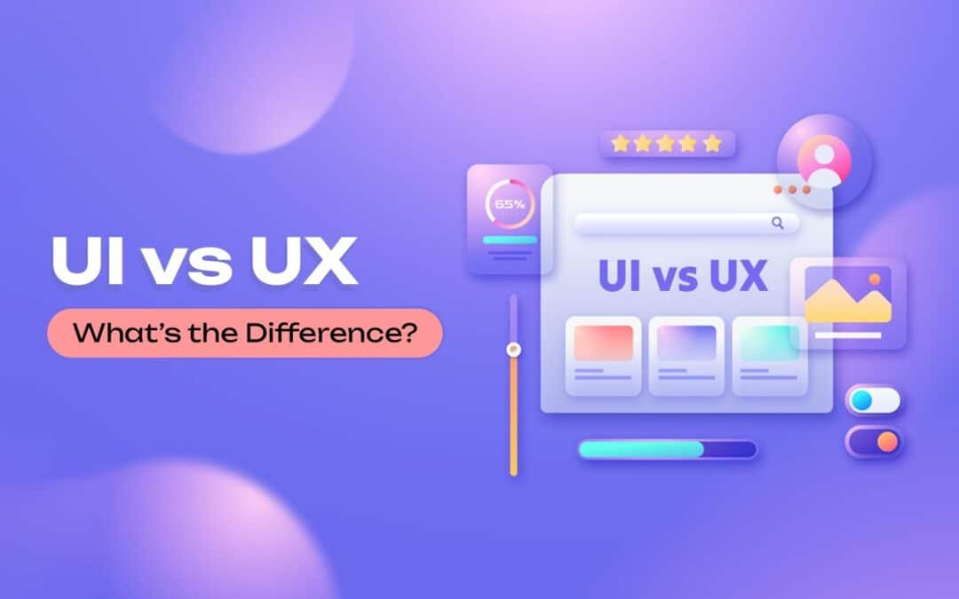
UI vs UX often get grouped, but they play very different roles in digital design. UI focuses on the look, feel, and interactive elements a user touches, while UX shapes the overall journey and how smoothly a user moves through a product. Modern digital design depends on both working together to create experiences that feel simple, intuitive, and enjoyable. When UI looks clean, and UX flows naturally, users stay engaged, and businesses build stronger products. As teams grow and digital expectations rise, understanding the difference between UI and UX becomes essential for creating tools that people love using. This guide breaks down each discipline clearly and shows how they come together in real design work.
What Is UI And UX
UI and UX describe two connected but different parts of digital design. UI refers to the user interface, which includes the visual layout, colors, buttons, icons, and all the digital interface elements a user interacts with. UX design focuses on the user experience, shaping how people feel as they move through a product and whether the journey meets their needs.
When discussing ui vs ux, it is important to understand that UI focuses on presentation while UX focuses on purpose and flow. Modern ui or ux design together to create products that are both functional and enjoyable to use.
Human-centered design guides this process by ensuring every decision supports real user needs. Strong ui ux alignment helps teams build digital designs that feel natural, smooth, and intuitive from start to finish.
Why UI And UX Are Not The Same Thing
UI and UX are connected, but they serve different purposes in creating a digital product. Understanding ui vs concepts helps teams design experiences that feel both visually appealing and truly useful. UI focuses on the visual surface, while UX looks at how well the product supports real user needs and how people feel throughout their interaction.
The difference between ui and UX becomes clear when looking at what each one influences:
UI focuses on:
Colors, typography, spacing, and layout
Buttons, icons, and visual elements that guide interaction
Making the interface look clean, modern, and easy to understand
UX focuses on:
User behavior and the motivations behind each action
Whether users can complete tasks without friction
The entire customer journey from first impression to final outcome
Both roles contribute to a positive user experience, but they achieve it in different ways. UX ensures the product is useful and meets expectations, while UI ensures the product is engaging and approachable. UX makes the path clear; UI makes the path enjoyable.
A seamless user experience happens when the flow, structure, and interactions support what the user wants to achieve. UI then enhances that flow with visuals that feel natural. When both work well, users enjoy a positive overall user experience because the design is clear, attractive, and easy to follow.
UI and UX are not the same thing because one focuses on aesthetics and interaction, and the other focuses on purpose, behavior, and satisfaction. Together, they create digital products that work, feel right, and support real user needs.
Core Responsibilities Of UI Designers
UI designers play a critical role in shaping how a product looks, feels, and responds visually. Their work ensures every screen is clear, consistent, and aligned with the brand identity while supporting a smooth, inviting user journey.
Creating Visual Elements That Shape The Interface
UI designers create the visual elements that users interact with every day. This includes colors, icons, typography, spacing, and other visual elements that guide attention and make the interface understandable at a glance. Their goal is to create an environment that feels organized, polished, and intuitive, so users never struggle to find what they need.
Building UI Components That Support Interaction
UI design focuses on designing ui components such as buttons, input fields, dropdowns, cards, sliders, and interactive cues. These elements must respond clearly when users tap, hover, or click. A UI designer ensures each component behaves predictably and fits the visual style of the product. These details help reduce confusion and support a consistent interaction model across every screen.
Developing A Visual Design System That Stays Consistent
Strong visual design is not only about aesthetics. It is about consistency. UI designers create visual design systems that define rules for color palettes, grid spacing, shapes, icons, and other visual elements. This helps teams maintain a unified appearance across websites, mobile apps, or dashboards. A consistent interface prevents frustration and allows users to move naturally through the product without feeling lost.
Ensuring Screens Are Aesthetically Pleasing And Functional
A key responsibility is balancing form and function. UI designers make interfaces aesthetically pleasing without compromising clarity. They ensure each screen feels welcoming and easy to understand, especially when many elements compete for attention. Their decisions help users feel comfortable and confident while navigating unfamiliar features. Good UI design supports and enhances the work done by UX designers, resulting in a smoother flow throughout the product.
Aligning The Interface With Brand Identity And Product Goals
UI designers must ensure that every design aligns with the brand identity. Colors, typography choices, and visual styles must reflect the tone and personality of the business. Whether the brand is playful, professional, bold, or minimalist, the UI must reinforce that identity across the product. UI designers also collaborate with product teams to ensure visual decisions support business goals and reflect what users expect from the brand.
UI designers shape the experience users see and interact with. Their careful approach to visual elements, ui components, design systems, and brand alignment brings clarity and beauty to every layer of the product. Their work transforms a functional interface into one that feels enjoyable, trustworthy, and memorable.
Core Responsibilities Of UX Designers
UX designers focus on shaping how a product works, how users move through it, and whether the experience feels helpful and meaningful. Their goal is to guide users smoothly toward their objectives.
User Understanding Through Research
A key part of a UX designer’s job is learning who the users are and what they expect. UX designers rely on ux research that includes conducting user research, user interviews, and observation. These methods uncover motivations, struggles, and behaviors that shape better decisions. The goal is to understand real needs instead of making assumptions. Research gives teams clarity and prevents design decisions that fail to support users.
User Personas That Represent Real Behavior
User experience designers translate research findings into user personas that represent major audience groups. These personas outline goals, pain points, preferences, and habits. When teams clearly understand these profiles, they evaluate every idea through the lens of how the persona would think or act. This helps teams stay aligned and reduces the chances of building features that do not solve real problems.
Information Architecture That Supports Clarity
Information architecture organizes content, menus, and pathways in a structure that feels natural. UX designers focus on creating layouts that help people find information quickly without confusion. When information architecture is clear, the digital product feels predictable and easy to navigate. Users should never feel lost or overwhelmed, and a strong structure makes every interaction smoother and more intuitive.
User Flow That Guides Task Completion
A user flow outlines each step a person takes to complete a task inside a product. UX designers map out these steps to identify unnecessary friction. They look at the sequence, decision points, and required actions to ensure users move forward easily. Whether the task involves onboarding, searching, or completing a purchase, a well-crafted user flow helps users reach the final step without frustration.
Pain Point Identification And Problem Solving
UX designers observe patterns, review feedback, and analyze data to identify pain points that interrupt the experience. Once these issues surface, they design solutions that remove barriers and guide users more effectively. This may involve simplifying steps, improving clarity, redesigning layouts, or restructuring how information is presented. Their goal is to create experiences that feel supportive and logical.
UX designers are essential to building a product that feels natural and user-friendly. They uncover what people truly need, create structure that supports that purpose, and design pathways that help users succeed. Their work ensures the final product feels coherent, thoughtful, and effective for every person who interacts with it.
How UI And UX Work Together In Product Development
UI and UX work side by side in the product development process to shape how a digital product looks, feels, and functions. When both disciplines align, teams create experiences that support the end user from the first tap to the final action.
Clear Roles That Support One Design Process
UI and UX design function together within one connected design process. UX sets the structure, flow, and logic behind the product, while UI shapes the final visual expression. UX ensures the journey makes sense. UI ensures the journey feels clear, attractive, and easy to follow. This collaboration keeps teams focused on what users need, not just what looks good.
Strong Foundations Built By UX Before UI Begins
The ux and ui relationship starts with UX defining user goals, mapping flows, and solving problems. Once this foundation is set, UI steps in to craft components, colors, and styles that make the solution understandable. This sequencing prevents rework and ensures the product development process stays efficient. UX skills guide the “why” and “how,” and UI brings the solution to life visually.
Interaction Design That Supports Intuitive Navigation
Interaction design bridges the gap between structure and visuals. It defines how a user interacts with buttons, gestures, menus, and transitions. This work ensures intuitive navigation across mobile apps, dashboards, and websites. UX defines the function behind each interaction, and UI designs the elements that make those actions visible. Together, they produce interactions that feel smooth and predictable.
Consistent Collaboration Focused On The End User
Throughout the project, UI and UX designers test ideas and improve the design through feedback and iteration. UX reviews whether tasks can be completed easily, while UI checks whether visual elements communicate clearly. Both roles work toward the same goal: supporting the end user with an experience that feels effortless.
A Unified Workflow That Strengthens The Digital Product
When UI and UX collaborate consistently, the digital product becomes more usable, more intuitive, and more engaging. UX ensures structure and clarity. UI brings emotion and personality. Together, they create products that work well and feel right for users in every environment.
Popular Tools And Techniques Used In UI And UX
UI and UX teams rely on a mix of creative tools, testing methods, and structured processes to design digital products that feel clear, accessible, and easy to use. These tools help teams understand users, shape layouts, and validate ideas before development begins.
Design Research That Guides Early Decisions
Design research helps teams understand the problem, the audience, and the context in which the product will be used. This includes user research, competitive analysis, and observational studies. Research sets the foundation for every UI and UX decision because it reveals what users expect, what frustrates them, and what opportunities exist for improvement. Without proper research, teams rely on guesswork, which often leads to weak or confusing experiences.
User Testing Methods That Validate Ideas
User testing is central to both UI and UX work. Teams share prototypes with real users to see how they interact with the design. This includes usability testing, where users attempt tasks while designers observe what works and what does not. Testing uncovers friction points early, allowing teams to refine layouts, flows, and interactions. It ensures ideas are validated before development begins, saving time and improving product quality.
Visual Design Elements That Shape UI Quality
UI designers refine visual design elements such as typography, color, spacing, icons, and layout structure. These elements influence clarity, mood, and comprehension. Graphic design principles help create an interface that feels balanced, modern, and visually coherent. UI design processes ensure each element guides users naturally while supporting the larger UX goals. Strong visuals reinforce brand identity and make the experience more memorable.
Responsive Techniques For Different Screen Sizes
Modern digital products must adjust gracefully across devices, so designers plan for multiple screen sizes. Teams create responsive layouts that scale and rearrange content without breaking usability. This process ensures mobile users, tablet users, and desktop users all receive a consistent experience. Testing across screen sizes helps identify layout issues early and ensures the interface remains readable, touch-friendly, and intuitive.
Techniques For Structuring Other Interactive Elements
UI and UX teams also refine other interactive elements such as buttons, forms, toggles, and navigation components. These elements guide how users move through an interface and complete tasks. Designers use interaction patterns that users recognize, reducing confusion and making the interface easier to navigate. Each interactive element is tested to confirm that it works smoothly, communicates clearly, and supports the intended goal.
Key Differences That Affect User Satisfaction And Performance
UI and UX shape how a user interacts with a digital product, and the differences between them directly influence satisfaction, clarity, and overall performance. When both are aligned, teams deliver an optimal user experience.
Visual Appeal That Shapes First Impressions
Users form opinions quickly, and a visually appealing interface can create instant interest. Colors, spacing, and typography influence comfort and trust. In the tech industry, where many user interfaces compete for attention, strong visual appeal helps a product stand out. A clean layout also reduces hesitation and encourages users to explore more confidently.
User Experience Design That Supports Real Tasks
User experience design focuses on whether the product helps users complete tasks without friction. Good UX looks at the target audience and considers their goals, frustrations, and habits. When the structure is clear and steps feel logical, users move through tasks smoothly. This clarity creates higher customer satisfaction because users feel supported rather than confused.
User Friendly Layouts That Improve Efficiency
A user-friendly layout helps remove unnecessary effort from the interaction. If navigation is simple, buttons are easy to identify, and paths feel obvious, users complete actions faster. Clear logic improves performance by minimizing errors and cognitive load. This leads to an experience where users feel in control of the product instead of overwhelmed by it.
Interface Behavior That Matches User Expectations
How an interface behaves affects how users respond. Smooth transitions, predictable actions, and clear feedback help users understand what happens after every click or tap. When an interface behaves as expected, people trust the product more. These small details create a more stable and predictable environment, which contributes to an optimal user experience.
Alignment Between UI And UX For Better Results
UI determines how the product looks, while UX determines how the product works. Both must support each other to create a strong experience. If the visuals are appealing but the flow is confusing, users become frustrated. If the flow is strong but the interface feels unattractive, engagement drops. Alignment ensures users feel comfortable, supported, and motivated throughout their journey.
Common Misconceptions About UI And UX
Many people assume UI and UX are the same, but these two fields focus on different parts of the user’s journey. Misunderstanding their roles can lead to poorly designed products and mismatched expectations.
UI And UX Designers Doing The Same Job
A common misconception is that ui and ux designers handle identical responsibilities. In reality, they work toward the same goal but through different approaches. UX focuses on structure, research, and problem-solving, while UI focuses on visuals, clarity, and interaction.
UI Designers Work Only On Colors And Fonts
Another assumption is that the ui designer’s job is limited to picking colors or adjusting typography. In truth, UI involves selecting design elements, shaping layouts, and defining how interactive elements behave. UI contributes to both beauty and usability.
UX Covers Everything And UI Is Optional
Some teams believe UX alone can create a smooth experience, but UI is essential. A strong experience requires more than logic and structure. The ui team ensures the design feels approachable, attractive, and consistent. Without UI, even strong UX can feel dry or confusing.
Aesthetic Elements Guarantee Good User Experience
People often think highly aesthetic elements automatically create good user experience. Attractive visuals help, but user experience depends on clarity, flow, and problem-solving. A beautiful interface can still frustrate users if steps are unclear or interactions feel forced.
Any Designer Can Work On UX Without Research
A final misconception is that UX does not require research. Many assume a designer can create user flows without understanding the user’s journey. In reality, UX relies on real insights, data, and user experience patterns. Without research, products fail to address real needs.
UI And UX Success Measuring Metrics
UI and UX success is measured by how well users understand the product, complete tasks, and feel throughout their journey. Strong metrics reveal whether the experience truly supports the target audience and delivers meaningful value.
User Testing Insights
User testing provides direct visibility into how users interact with the interface. It shows where they hesitate, what confuses them, and which parts feel natural. Observing real actions helps teams understand whether the interface supports intuitive decision-making. These insights help refine layout, spacing, cues, and pathways. When users move confidently through key actions, the product demonstrates stronger UI and UX performance. If they struggle, it becomes a clear signal to adjust messaging, hierarchy, or component behavior.
Usability Testing Outcomes
Usability testing measures how effectively people complete tasks in the user flow. It highlights where steps feel unclear, where users take unnecessary actions, or where slowdowns occur. These outcomes help identify friction that reduces performance and satisfaction. Reviewing usability results guides improvements in navigation, task structure, and interaction logic. When usability testing shows shorter completion times and fewer mistakes, the experience becomes more polished and dependable for users.
User Behavior Patterns
User behavior patterns reveal how people naturally interact with the product. This includes pages visited, actions taken, drop-off points, and navigation choices. By understanding behavior trends, teams can see what attracts attention and what gets ignored. These patterns show whether the interface aligns with expectations and whether users understand where to go next. Strong behavior patterns indicate clarity, while weak patterns suggest missing cues or misplaced elements.
Customer Satisfaction Scores
Customer satisfaction scores show how users feel after engaging with the product. Surveys, ratings, and feedback highlight whether the experience meets expectations. High satisfaction means the journey feels clear and supportive. Low satisfaction signals deeper issues such as confusion, frustration, or unmet needs. These scores help teams understand emotional responses that are not visible in analytics.
Journey Performance Metrics
Journey metrics measure how well the entire customer journey flows from beginning to end. They examine completion rates, drop-offs, and transitions between steps. A smooth journey shows the design supports users at every point, while inconsistent performance highlights gaps that break momentum. Reviewing journey performance ensures the experience remains connected and logical across features and devices.
Together, these metrics give a full picture of UI and UX design process effectiveness, helping teams improve clarity, performance, and the overall experience.
How GainHQ Helps Teams Deliver Better UI And UX Experiences
GainHQ supports teams by giving them a unified design environment that brings ui and ux design together in a smoother, more organized workflow. The platform streamlines the web design process so teams can produce clearer interfaces, stronger structures, and more consistent digital design. Collaboration tools keep everyone aligned, allowing designers, developers, and product managers to share updates and maintain team alignment without delays.
Real user insights help teams make informed product improvements, ensuring decisions match real needs instead of assumptions. Faster iterations allow teams to refine screens, adjust flows, and resolve issues quickly. With better workflows in place, teams move from concept to completion more efficiently, creating digital products that feel more intuitive, polished, and user-friendly from the start.
FAQs
What Is The Main Goal Of UI In A Digital Product?
The goal of UI is to create a clear and visually structured interface that guides users without confusion. It focuses on layout, colors, buttons, spacing, and readability. A strong UI helps users understand actions instantly and reduces the effort required to interact with the product.
How Does UX Improve Overall Product Success?
UX improves product success by shaping how well the product supports user needs. It focuses on task flow, structure, clarity, and ease of use. When the experience feels smooth, users complete tasks faster, feel less frustration, and develop trust. This leads to better engagement and long-term satisfaction.
Can One Designer Handle Both UI And UX?
One designer can handle both roles in smaller teams or simpler projects. However, UI and UX require different skills. UI focuses on visuals and interaction details, while UX focuses on research, structure, and problem-solving. Larger products often benefit from having separate specialists.
Why Do UI And UX Need Continuous Updates?
UI and UX need ongoing updates because user expectations, technology patterns, and product requirements change over time. Regular improvements keep the design modern, accessible, and aligned with how users behave. Continuous updates also fix usability issues before they affect the experience.
How Does User Feedback Influence UI And UX Decisions?
User feedback highlights what works and what does not. It reveals confusion, friction, or missing elements. Teams use this information to adjust screens, flows, wording, and visuals. When decisions are based on feedback, the product becomes easier to use and more aligned with real user needs.
1
Cookie Consent
We use cookies to improve your experience on our site. By using our site, you consent to cookies.
Cookie Preferences
Manage your cookie preferences below:
Essential cookies enable basic functions and are necessary for the proper function of the website.
Name
Description
Duration
csrftoken
Security cookie used to prevent cross-site request forgery (CSRF).
Session
Cookie Preferences
This cookie is used to store the user's cookie consent preferences.
180 days
Statistics cookies collect information anonymously. This information helps us understand how visitors use our website.
Used to collect anonymous website usage statistics and performance insights via Ahrefs tools.
Used by Google Analytics to determine which links on a page are being clicked
30 seconds
_ga_
ID used to identify users
2 years
_gid
ID used to identify users for 24 hours after last activity
24 hours
_gat
Used to monitor number of Google Analytics server requests when using Google Tag Manager
1 minute
_gac_
Contains information related to marketing campaigns of the user. These are shared with Google AdWords / Google Ads when the Google Ads and Google Analytics accounts are linked together.
90 days
__utma
ID used to identify users and sessions
2 years after last activity
__utmt
Used to monitor number of Google Analytics server requests
10 minutes
__utmb
Used to distinguish new sessions and visits. This cookie is set when the GA.js javascript library is loaded and there is no existing __utmb cookie. The cookie is updated every time data is sent to the Google Analytics server.
30 minutes after last activity
__utmc
Used only with old Urchin versions of Google Analytics and not with GA.js. Was used to distinguish between new sessions and visits at the end of a session.
End of session (browser)
__utmz
Contains information about the traffic source or campaign that directed user to the website. The cookie is set when the GA.js javascript is loaded and updated when data is sent to the Google Anaytics server
6 months after last activity
__utmv
Contains custom information set by the web developer via the _setCustomVar method in Google Analytics. This cookie is updated every time new data is sent to the Google Analytics server.
2 years after last activity
__utmx
Used to determine whether a user is included in an A / B or Multivariate test.
18 months
PostHog is used to collect anonymous usage statistics and product interaction data to help improve website performance and user experience.
Used by PostHog to store anonymous analytics and track user interactions.
1 year
Functional cookies enable additional features such as live chat and personalized interactions. Some features may not work properly if these cookies are disabled.
Enables live chat functionality and session continuity.
Name
Description
Duration
chat_session_id
Maintains the user’s chat session during interactions with live chat.