Adaptive vs Responsive Design: What's the Difference and Which Should You Use?
by GainHQ Editorial Team | Oct 26, 2026 | Software Development Insights | Editorial policy
Table of Contents
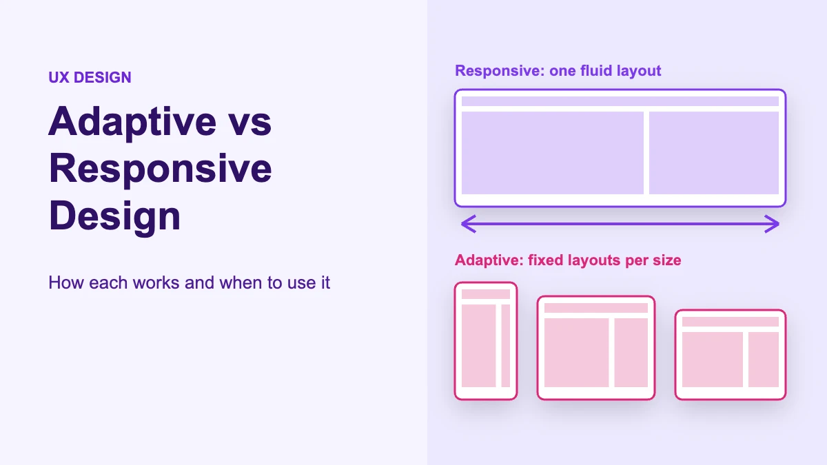
Responsive design uses one fluid layout that stretches and rearranges itself to fit any screen width. Adaptive design detects the available space, or sometimes the device, and switches between a small set of layouts made for specific sizes. Most modern websites are responsive overall and use adaptive techniques for a few components, and most native apps are adaptive.
This guide covers the web and app UI meaning of the terms. (In medicine, "adaptive design" means something unrelated: a clinical trial whose plan can change based on interim data. This page does not cover that.)
Quick comparison
| Responsive design | Adaptive design | |
|---|---|---|
| Layouts | One fluid layout | Several layouts, one per size range |
| Between breakpoints | Content keeps resizing smoothly | Layout stays fixed until the next breakpoint |
| What it reacts to | Viewport (or container) size, in CSS | Window size class, viewport, or server-side device detection |
| Typical tools | Fluid grids, flexible images, media queries, container queries | Fixed-width CSS per breakpoint, dynamic serving, native size classes |
| Where it's common | Websites and web apps | Native iOS/Android apps, some legacy and high-traffic sites |
| URLs | One URL, same HTML | Same URL (dynamic serving) or separate mobile URLs |
| Google's view | Recommended | Supported, with extra setup |
What is responsive design?
Responsive design is a way of building one page that adapts continuously to the space it is shown in. Ethan Marcotte coined the term in his May 2010 A List Apart article "Responsive Web Design", which combined three ingredients: fluid grids, flexible images and CSS media queries.
His argument was that, instead of "tailoring disconnected designs to each of an ever-increasing number of web devices", we should treat them as facets of one experience. MDN describes it the same way today: responsive design "isn't a separate technology — it is an approach", and modern layout tools such as Flexbox and Grid are responsive by default.
A minimal responsive layout looks like this. The page starts as a single column and adds columns as space grows:
<meta name="viewport" content="width=device-width, initial-scale=1">
.products {
  display: grid;
  gap: 1rem;
  grid-template-columns: 1fr;
}

@media (min-width: 48em) {
  .products { grid-template-columns: repeat(2, 1fr); }
}

@media (min-width: 75em) {
  .products { grid-template-columns: repeat(3, 1fr); }
}
Between those breakpoints, the columns still stretch and shrink. That is the "fluid" part, and why responsive and fluid design are often used together. The viewport meta tag matters: MDN notes that without it, mobile browsers render at a wider default width and your narrow-screen media queries may not apply.
Container queries: responsive components
Container queries let a component respond to the size of its own container instead of the whole viewport. This is the biggest change in responsive design since 2010, and most comparison articles skip it.
MDN explains that @media applies styles based on viewport size, while @container applies styles based on a containing element's size. Size container queries have been Baseline widely available since February 2023. They are defined in the W3C's CSS Containment Module Level 3.
.card-slot {
  container-type: inline-size;
}

.card {
  display: grid;
  gap: 1rem;
}

@container (min-width: 30em) {
  .card {
    grid-template-columns: 10rem 1fr;
  }
}
The same card can now sit in a narrow sidebar (stacked) and a wide main column (side by side) on the same page. A viewport media query cannot do that, because the viewport is the same in both places.
What is adaptive design?
Adaptive design, in web and UI terms, means building a set of distinct layouts and showing the one that fits the current screen or window. Unlike responsive design, an adaptive layout does not change between breakpoints. It snaps from one fixed version to the next.
There are three common ways to build it.
1. Fixed layouts per breakpoint, in CSS. The page uses fixed widths that jump at set points:
.page {
  width: 100%;
}

@media (min-width: 768px) {
  .page { width: 720px; margin-inline: auto; }
}

@media (min-width: 1200px) {
  .page { width: 1140px; }
}
2. Server-side delivery (dynamic serving or separate URLs). The server reads the request's user agent and returns different HTML for mobile and desktop. Google's mobile-first indexing documentation lists this as "dynamic serving" (same URL, different HTML, which relies on user-agent sniffing and the Vary: user-agent header) or "separate URLs" (for example, an m-dot site). A dynamic serving response includes a header like:
HTTP/1.1 200 OK
Content-Type: text/html; charset=utf-8
Vary: User-Agent
3. Native size classes in apps. This is where adaptive design is the standard approach today. Apple's Human Interface Guidelines describe size classes as "an indication of how much horizontal and vertical space is available," each either compact or regular. Apple tells designers to "determine layout based on size classes, not device type or orientation."
import SwiftUI

struct InboxView: View {
    @Environment(\.horizontalSizeClass) private var horizontalSizeClass

    var body: some View {
        if horizontalSizeClass == .compact {
            VStack { /* stacked list, then detail */ }
        } else {
            HStack { /* list and detail side by side */ }
        }
    }
}
Android does the same with window size classes: compact (under 600dp wide), medium (600–840dp), expanded (840–1200dp), large (1200–1600dp) and extra-large (1600dp and up). Google stresses that these depend on the space available to the app, which changes with split-screen, foldables and resizable windows, and are not meant for "isTablet" logic.
val windowSizeClass =
    currentWindowAdaptiveInfo(supportLargeAndXLargeWidth = true).windowSizeClass

val useTwoPane = windowSizeClass.isWidthAtLeastBreakpoint(
    WindowSizeClass.WIDTH_DP_MEDIUM_LOWER_BOUND
)
This is what "adaptive UI" usually means: the app picks a layout (one pane, two panes, a navigation rail instead of a bottom bar) based on a small number of size categories.
A note on the name "adaptive web design"
"Adaptive web design" has two meanings, and competitor articles often mix them up. Many articles credit Aaron Gustafson with the term. His book Adaptive Web Design: Crafting Rich Experiences with Progressive Enhancement (first edition May 2011, second edition December 2015) is about progressive enhancement: building a baseline that works everywhere and layering improvements on top. It is not about serving a set of fixed-width layouts. When people compare "adaptive vs responsive" today, they almost always mean the fixed-layouts sense, so that is what this article uses.
Adaptive vs responsive design: the key differences
The core difference is continuous versus stepped. Responsive design reshapes one layout at every width. Adaptive design picks one of a few pre-built layouts and holds it until the next threshold.
That difference drives everything else:
- Design effort. Responsive needs one flexible design, tested across a range. Adaptive needs one design per layout, each fully specified.
- Unexpected sizes. A responsive layout handles a new screen size without extra work, although it still needs testing. An adaptive layout shows whichever version is closest, which can leave gaps or crowding.
- Control. Adaptive gives designers precise control at each size, which suits complex screens such as dashboards, editors and data-heavy views.
- Where the logic lives. Responsive logic sits in CSS on the client. Adaptive logic can sit in CSS, on the server or in the native layout system.
One correction to a common claim: media queries do not detect devices. They test features of the viewport, such as its width. That is why a responsive site behaves the same in a narrow desktop window as on a phone. Only server-side adaptive delivery actually inspects the device, through the user agent.
Performance and SEO trade-offs
Neither approach is automatically faster. Performance depends on what you send and how you load it, and both approaches can be fast or slow.
A common claim is that "adaptive sites are faster because they send device-specific assets." That was a stronger argument before responsive images existed. Today a responsive page can serve the right image size with srcset and sizes, reserve space with width and height to prevent layout shift, and lazy-load off-screen images, as web.dev's responsive images guide shows:
<img
  src="photo-600.jpg"
  srcset="photo-300.jpg 300w, photo-600.jpg 600w, photo-1200.jpg 1200w"
  sizes="(min-width: 66em) 33vw, (min-width: 44em) 50vw, 100vw"
  width="1200"
  height="800"
  alt="Product photo"
  loading="lazy">
Measure the result against Core Web Vitals. The current "good" thresholds, at the 75th percentile of page loads, are LCP of 2.5 seconds or less, INP of 200 milliseconds or less, and CLS of 0.1 or less. INP replaced First Input Delay (FID) in 2024, so guides that still list FID are out of date.
Server-side adaptive delivery adds its own costs: user-agent detection has to stay current, caches must respect Vary, and every version needs testing.
For SEO, Google's position is clear: "Google recommends Responsive Web Design because it's the easiest design pattern to implement and maintain" (Google Search Central). Adaptive is still supported, but with conditions. Google indexes the mobile version, so the mobile HTML must contain the same primary content, structured data, titles, meta descriptions, headings and alt text as desktop. Separate mobile URLs also need the correct rel="canonical" and rel="alternate" annotations. Missing content on the mobile version is the most common way adaptive sites lose rankings.
If you are setting up performance checks for a new build, our guide to software performance testing covers how to plan them.
Myths to ignore
Several claims repeat across top-ranking articles without a source. Here is what the primary documentation actually says.
| Common claim | What the sources say |
|---|---|
| Adaptive design uses six standard widths: 320, 480, 760, 960, 1200, 1600px | There is no standard. MDN advises setting breakpoints where the content needs them and using relative units. Android's real breakpoints are 600, 840, 1200 and 1600dp. |
| Aaron Gustafson defined adaptive design as multiple fixed layouts | His 2011 book is about progressive enhancement. |
| Responsive design detects the user's device | Media queries test the viewport, not the device. |
| Adaptive design requires a separate mobile site | Google lists dynamic serving: same URL, different HTML. |
| Core Web Vitals are LCP, FID and CLS | INP replaced FID in 2024. |
| Responsive sites never need changes for new screens | They adapt better than fixed layouts but still need testing, especially on foldables and very wide screens. |
When to use adaptive vs responsive vs hybrid
Choose responsive for most websites and web apps, adaptive for native apps and screens that need very different layouts per size, and a hybrid when you want both. The table below maps common situations to an approach.
| Situation | Best fit | Why |
|---|---|---|
| New marketing site, blog or content site | Responsive | One codebase and one URL; Google's recommended setup |
| Web app with reusable components (cards, widgets, tables) | Responsive + container queries | Components adapt to wherever they are placed |
| Native iOS/Android app | Adaptive (size classes) | Platform guidance is built around size classes |
| Data-dense screens (dashboards, editors) | Hybrid | Fluid within a layout, but switch to a different structure (e.g. one pane to two) at set widths |
| Large legacy desktop site needing a mobile experience fast | Adaptive, short term | A separate mobile layout can ship sooner than a full refactor; plan a responsive rebuild |
| Very different tasks on mobile vs desktop | Adaptive or hybrid | Even Marcotte acknowledged "a business case for separate sites geared toward specific devices" when mobile users have narrower goals |
In practice, "hybrid" is the default for well-built products. The page grid is responsive. Navigation switches from a bottom bar to a sidebar at a set size, which is adaptive behaviour. Individual components use container queries. If you are building a web app on a modern framework, the choice of React, Angular or Vue matters less here than how your design system defines breakpoints and component rules.
How to decide on a real project
Decide on breakpoint behaviour early, and write it into requirements so designers and developers build to the same rules. A simple process:
- List your real contexts. Check analytics for the viewport widths your users actually have, not a generic device list.
- Design the extremes first. Apple recommends testing the largest and smallest layouts first; Android suggests designing for expanded width, then adding a specialised medium layout if needed.
- Set breakpoints where content breaks, not at device widths.
- Decide what switches structure (adaptive) and what only stretches (responsive), component by component.
- Write it into your specs. Add breakpoint behaviour to your product requirements document and include it in acceptance criteria, for example "at widths under 600px, the filter panel collapses into a drawer".
- Test against Core Web Vitals on real mobile devices, not only a desktop browser at narrow width.
For an example of how layout decisions play out in a design process, see our UX design case study. If the multi-device work is part of a new product, factor it into your MVP timeline: each extra adaptive layout is another design and test pass.
How GainHQ can help
GainHQ is a custom software development company with 15+ years of experience and 13+ products built. Our 30+ person team designs and builds web and mobile products, including our own in-house products, Payrun (HR and payroll) and Gain.io (CRM and helpdesk). If you need help choosing a layout strategy, setting up a design system with clear breakpoint rules, or building a responsive web app or adaptive mobile app, see our UI/UX design and custom software development services.
Frequently asked questions
What is the main difference between adaptive and responsive design?
Responsive design uses one fluid layout that adjusts continuously to any width. Adaptive design uses several fixed layouts and switches between them at set breakpoints, so the layout snaps rather than flows.
What is adaptive design in web and UI terms?
It is an approach where you build a small set of distinct layouts and show the one that fits the available screen or window. It is done with fixed-width CSS per breakpoint, server-side dynamic serving, or native size classes in iOS and Android apps.
Can you give an example of adaptive design?
A native app that shows one pane on a phone and a list-plus-detail two-pane view on a tablet is adaptive. Android's window size classes (compact, medium, expanded) and Apple's compact and regular size classes are built for exactly this.
Is responsive or adaptive better for SEO?
Google recommends responsive design because it is the easiest to implement and maintain. Adaptive setups are supported, but the mobile version must contain the same primary content and metadata as desktop, and separate mobile URLs need correct canonical and alternate tags.
Is adaptive design faster than responsive design?
Not automatically. Responsive pages can serve right-sized images with srcset and sizes, lazy-load images, and reserve space to avoid layout shift. Measure both against Core Web Vitals: LCP of 2.5s or less, INP of 200ms or less, CLS of 0.1 or less.
What breakpoints should I use?
There is no standard set. MDN advises adding breakpoints where your content starts to look bad and using relative units. For native Android apps, Google's window size class breakpoints are 600, 840, 1200 and 1600dp wide.
How can I tell if a website is responsive or adaptive?
Slowly resize a desktop browser window. If the layout flows smoothly at every width, it is responsive. If it holds a fixed width and then jumps at certain points, it uses adaptive layouts. Many modern sites mix both.
What is the difference between fluid and responsive design?
Fluid design means widths are set in relative units so content stretches with the screen. Responsive design combines fluid layouts with flexible images and media queries, so the layout can also restructure at breakpoints.